Boston Scientific sponsors Gopher sports which is great. As a part of that sponsorship they get a certain amount of advertising at events. Last month I was asked by HR if I might be interesting in creating animation for use at the Gopher football games at the Metrodome. Hell yeah!
This is a still from the animation. Click on it to see the full resolution version. Be ready to scroll!
Right off I hit on the idea of the long strip being a blood vessel so I thought blood cells would make a neat backdrop to the text and logo treatments. I also tried more 3D cells but the more graphic cells looked better and didn't screen blood!
The display it would play on is one of those wrap around LED displays between upper and lower desks. I've usually seen them as continuous bands all the way around but the dome display was just stand alone with the bizarre resolution of 2400 by 40 pixels. By contrast, a TV is generally speaking 640 by 480 pixels. The whole piece only 17 seconds long and designed to loop for as long as they play it during breaks in the action. Its so wide that it's hard to put onto the blog. But is you want to see it, right click on this link and down load it. Then play it in Quicktime.
Here is a photo at the dome. The animation is the blue strip in the middle and just peeking in on the right.
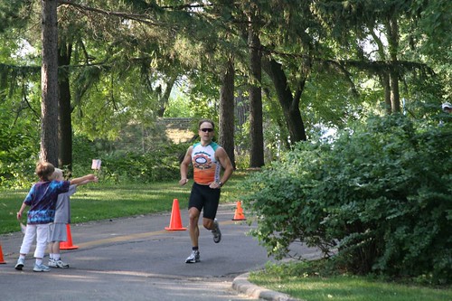
OK, so I have to come clean on the photo. It's a fake. I couldn't find anyone to take a photo at a game so with a little help from some nameless Gopher fan on Flickr, I was able to find a random game photo. It nicely shows the display - just not the right message. No problem. Here's how I did it. Click on the images for a zoom in.
Here is the orginal. With a little color and contrast adjustment.
I saved one frame (this one) from the animation. Then scaled it down and warped it slightly to the curve of the stands. I was kinda luck that it's mostly flat to the camera so I didn't have to correct for perspective.
The new display does not look like its lit up so I had to add some glare and boost the saturation.
Much better. I also added subtle things like noise to the new elements and grunged up the edges. The CG elements were too perfect.
11/13/2008
BSC at the dome
4/13/2008
Paper Making Class


In honor of our 6th wedding anniversary, Linda and I took a Japanese paper making class at MCAD. As with a lot of Japanese things, there is a long history and tradition in paper making. We learned how to beat the fibers and screen out the gossamer thin sheets. We then explored various techniques of dying and coloring the sheets we made.


We made a lot of paper in the five Saturdays we attended. We also made a giant 4x6 foot sheet which took the help of the 6 people.

Probably the most interesting thing I learned is that rice paper is a complete myth. Rice actually is not fibrous enough to produce paper. Most all Japaneses paper is made from a few different plants similar to cat tails or reeds.


4/10/2008
20 Years Ago Today...
Today is my birthday. Big deal, everyone has one. But what is neat is that I had recently discovered that a piece of artwork I've had since college was actually a birthday gift. It's hard to make out but in the upper part of this photo is the date 04/10/88. It was given to me by my dear friend Jackie while I was in my senior year at UND. We used to call her 'Bunnie'.
And this is the artwork itself. Jackie is still making art that can be seen here.
3/24/2008
How To Decorate with Photoshop
We plan to use the hallway of our newly finished basement to show off vacation photos. The walls are about 12 feet on one side and 7 on the other. I've had trouble deciding how many frames to order and what color. Since the wood is all maple in the house I considered maple frames but I also thought black frames would look nice with photos.
So I turned to Photoshop to help me. First I photographed the hallway. Yes, that is the wall color!
Next I went to americanframe.com to get a framed photo. I have used American Frame many times for custom frames and have had great luck with then. Very inexpensive way to frame. The website has a neat ordering system where you can upload your artwork, then try out their frames so you can decide color as well as matting. Slick. After I picked out a frame I liked I simply did a screen snap into Photoshop as below.
In Photoshop I was able to position and copy the photos onto the wall. For those Photoshop users out there, I used the vanishing point tool to make sure they followed the perspective of the wall. Note that the farthest frame is smaller then the foremost. A slight emboss was added to give the frames their thickness and lastly a drop shadow behind to match the spotlight direction.
Here are the maple frames on the wall. It was pretty clear to me that the black frames were much better then the maple. The lighter wood on the green wall wasn't as striking.
As a final touch, just to see how realistic I could make it, I added some lighting to the otherwise flat black frames. Since the frames were added digitally they didn't get the same spotlight variation that the wall did. Not to mention the ambient green color bouncing off the other wall. The following images shows where the photos would be and the lighting that will fall on it. This was done by making a copy of the wall layer, masking out all but the frames then reducing the transparency of the new layer till there was a slight coloring on the frames. A very subtle effect but one that the eye would notice.
Here is the final composite. Note that the light and coloring on the frames is now more accurate.
Below is the Photoshop layers of the project. Each group was a different framing consideration.
2/01/2008
Shibuya Panorama Revisited

I just had to go back into this panorama. So much of what makes this corner so cool are all the huge video screens. I think there are 3-4. But the pano doesn't really show them. The overexposed one on the right, called Super Lisa, was kind of unavoidable but the monster one right in the middle, the Q-Front, is barely noticeable - and its 3 stories high! It was bad timing that there wasn't a feed when I snapped the 3 shots for the panorama. But looking through all my photos of that evening I came across a shot with a decent exposure of both screens. So I just had to go back in. The Super Lisa monitor was simple. I cropped out the screen area on the original and scaled the image to fit. A little color correction and it was done. The Q-Front was a little more tricky because of the grid running through the image and the building. But actually the grid helped me register the 2 as I scaled down the image on a separate layer. Once in place I used a little math to do the combining. I set the image layer blend mode to Add which takes the pixel value of the top layer and adds it to the pixel value layer underneath. So white (256) + black(0) = 256 (white). So what happens is that all the black of the image at a value of 0 does not get added to the original wall color. No need to do a ton of erasing. Neat huh?
One last thing I had to do was to go into the added images and try to match the noise. It's a little weird to think about adding noise but if you looked really closely you would notice the videos being smoother then the surroundings. That can tell the brain that something funny is going on.
To me this now better captures my experience of Shibuya even thou it is not a photo of a real moment in time.
1/04/2008
Sutro Bath Lilly
 Linda and I spotted these lilies while exploring the Sutro Bath ruins in San Francisco. They didn't seem all that remarkable until I got home and worked the photo over in Lightroom. I tried a few different looks including black and white but this one looked the best. There is something about the yellow that really draws me in. And the leaves are also intriguing without being the center of attention. I struggled with the background blossom. At first I wanted a vertical orientation on just the foreground but the white of the background flower felt distracting. So I decided to simply include it completely with a horizontal. luckily the leaves on the left create a nice diagonal up through the main flower and saves the composition.
12/30/2007
Lighthouse Planet

This is the same lighthouse as in my previous post only I have distorted it into a sphere. It's a fun technique that I recently found on the web. I've been wanting to try it and the lighthouse seemed a good subject. Mostly it's a Photoshop trick using the filter Polar Coordinates to curve the photo around on itself. Then it's just some digital cleanup.
Lighthouses always seem so sad and lonely. I can imagine this lighthouse being far away from every other planet and manned by a lone person dedicated to keeping the skies safe. If you look really closely at it, or in the original, you will see that the person is Linda's sister Sharon. Can you find her?
There are a whole bunch of these on Flickr - although this is my only one.
Pigeon Point Lighthouse

After looking at the elephant seals on Christmas Eve, I stopped at a nearby lighthouse. Since it was such a nice day I was hoping to get some great shots of the lighthouse. The Pigeon Point Lighthouse is no longer in use (probably due to satellites and GPS) and is in serious danger of falling down. Luck for us it looked sturdy enough. An interesting fact is that it is named after a ship and not the obvious assumption of the bird. I guess it is true of many light houses up and down the coast.
It was late afternoon when I shot this so the colors were really starting to pop. It was also neat that there was a observation deck built out on a rock on the ocean side. It offered a great spot to be able to shot back towards the builds and the coast with the sun behind me. I can't think of a better time and place to photograph this landmark. I felt luck to be there.
This is another panorama of 6 photos. The black area at the bottom is where I did not shoot photos. So the bottom curve could be considered the rotation path of the camera. The exposure of the sky across the whole pan was too difficult to match in the stitching software so I ended up masking out the sky and replacing it with a gradient based on colors in the original sky. It's very close to the original, just more even. Click on the image for the larger version.
11/25/2007
Dave Badman

My old friend Dave Badman was in town to install a piece of artwork at a financial office in Arden Hills. Dave asked me to help him because some of the parts were very heavy. There are about 8 parts that needed to be mounted on the wall and bolted all together. Dave and his welder Mark did an amazing job of engineering to get everything to fit. The photo doesn't do it justice. The grinder markings give the panels a shimmering quality that is almost 3D and seems to be in constant motion.
Ever since we finished art school at the University of North Dakota, Dave has run a very successful jewelery design business in our hometown of Grand Forks, ND. In more recent years he has gotten into large metal installations like the one above. Last year he designed a stainless steel and copper fireplace front for our basement.
9/30/2007
Montalcino Panorama

Here is another panorama from Italy. This time from the top of the castle in Montalcino Italy.
9/13/2007
Drawing Class Final

The drawing class is over now. The last assignment was an extra one that Iain would do individual critics of. The assignment was to do another self portrait but now with the knowledge of the last 10 weeks. I definitely applied things I learned about proportion and drawing the volume of shapes. I'm not sure that it looks any more like me by I like the second drawing more. The following is Iain's comments;
Iain's word to me, and the other 5-6 people who did the extra work, are very motivating. Not only is he an amazing artist who is inspiring just to look at, but he is also a gifted educator.
8/20/2007
Drawing Class Update

I'm nearing the end of the online drawing class I have been taking. Only one week to go. In the last few weeks it's been difficult to keep up but I think in all I only missed 1 of the 10 assignments. I haven't been exposed to anything dramatically new - it is a basic class after all - but it has been a great experience and really forced me to draw. Why a moose? I have no idea. I found an image of a moose in google while searching for something else.
The above drawing is a contour drawing. The purpose is to use just lines to form the volume of the subject. It forces the artist to think in terms of shapes and volumes instead of trying to reproduce the lights and darks. It's an excellent exercise and one that I will continue to explore.
6/26/2007
Drawing Class

Last week I joined an online drawning class with a group called Pixel Corps. It's being taught by Iain McCaig who is an incredible artist most noted for working on designs for Star Wars. The way it works is that Iain puts up a video intro on some aspect of drawing, after which we have 4 days to work on the drawing, then put them up on a website that only the class member can see. Everyone can look at and critique if they want. On Thursdays Iain picks out a few to critique to the whole group. We will go for 10 weeks.
It's a beginning drawing class so I expect the lessons to be basic. But basics are good and having a reason to make me draw is really good. It's also a chance for me to work with a tablet and the computer. I'm going to do all the drawings digitally on the computer using a Wacom and Sketchbook Pro.
So far we have done a self portrait and this week we worked on balance. The particular drawing excercise above was to balance things on top of a bucket on a stick. We also had to make a figure balanced then unbalanced. I'll post more about the class as it progresses. Hopefully we'll see an improvement.
2/17/2007
Jersey Design Process
 In 2005 I took it upon myself to design a biking jersey for our club at work. For years before that we had talked about how cool it would be to have one but, as always, nobody wants to do the work. I finally decided that if I did it at least I would like it enough to wear it. Being that most of the club riders are engineers, it was probably best in the long run that I stepped up.
The first image in this post is from the concept phase. What it shows is how I played around with the corporate color scheme (green with orange) on the body and sleeves - trying to find a nice balance without being too green. I'm not a big green fan. In the concept phase I came up with 2 candidates. One design was more aggressive then the other. I figured I would let the group decide on which one to use. The next image is of those 2. Which one would you vote for? As I recall it was a pretty close race but the more conservative design won. Not all that surprising.
 Next I sent the design to Voler to be printed. They took my computer file and combined it with their template. The 3rd image is the resulting artwork that was printed. What is very interesting about their process is that this artwork has all the sizes on it. If you look closely you can see the outlines of all the sizes starting with the x-large on the outside, then large, medium, etc... It's a very cleaver way to cut down on the amount of unique printing.
The jersey was a big success and I ended up ordering around 150. When I started out I was worried I wouldn't even get the minimum order of 25 jerseys!
You can see me wearing the jersey here.
1/24/2007
UltiMed Animation
 Last Summer I did a freelance animation project for a contract engineering company. It was to demonstrate a new product they designed for the dispensing and disposal of syringes. A version of the animation has become a part of the company homepage. UltiMed
They messed around with the timing of the animation and slowed it down - which makes it slightly jittery. I often run into this. Customers are always concerned that the viewer will not 'Get it' unless it's really slow. Yet one of the benefits of animation, and particularly web animation, is that viewers can stop it, rewind it, and generally watch it until they 'Get it'. I believe the concerns comes from a TV mentality where you get to see something once and then it's over.
1/18/2007
Notebook Sketch
 At work I was recently asked to visualize a new device concept. It was sort of an odd looking design that led to my comment that it was like putting Frankenstein's head on Tyra Bank's body. That in turned lead to my notepad doodle. I kinda liked it so I decided to show it here. I always have a notebook by me to take down information as well as sketching. I have a stack of old pads that are like my visual work diary. It's fun to look back at them.
Did Frankenstein ever smile? Maybe he would have if given a better body.
3/27/2006
First Animation

'The Nissa' is an idea I still think about and would love to do more with. This project was done as if it were a trailer or advertisement of a movie. The Nissa is a troll that is assigned to protect a house. The main problem for him is the house itself and all it's annoyances like dust bunnies and electrical shorts (as briefly seen in the trailer). He flies around on a magical hammer that might just be smarter then the Nissa is. It helps him out. Oh, and he turns to stone during the day which accounts for all those ugly 'statues' in the gardens.
The narrator in the movie is me and the story I tell is not completely true, although my Dad did talk about the Nissa when I was very young. The Nissa (or Nisser) is a part of Norwegian folklore and is a very michevious troll. The most famous story involves the Nissa, a farm girl, and a bowl of oatmeal.
I did this project in Macromedia Director because that was what our Professor knew. Everything was first hand drawn, inked, then scanned into my computer. My friend Bryn Hendrickson (a comic artist himself) helped me ink the backgrounds. I would really like to redo 'The Nissa' in Adobe After Effects because I could do a little better job with the better tools. Would that make me like George Lucas? Should I leave it as is?
nissa_final.wmv
3/20/2006
Sketch09

This was one of my favorites and one of most enjoyable drawing days I had in 2005. It was while Linda and I were in Tucson for her tennis tournament. Near Tucson is the Air Force 'boneyard' where some 4000 decommisioned jets are stored. There is also a huge air museum there that anyone can wander around. I spend 4 hours walking around the planes, photographing and sketching in the 100 degree desert sun. It was so quiet that I could hear the creaking and groaning of the metal flexing in the heat. It was so cool. The B-58 has always been one of my favorites jets. It's big and fast! It even looks fast sitting in the desert.
When I got back to the hotel I showed the sketches to Rich, the other husband that came along. He glanced at it then put it down. As I was talking about my day he picked up the sketchbook again and exclaimed, "Wait, you drew these?!?". He had dismissd them as something I had bought.
More sketches
I've added the rest of the sketches that I plan to post to flickr. There are more but I decided to just hit the highlites. I'll single out a few to write about in the future but for now you can find them here.
3/16/2006
Photoshop Presentation
Last Thursday I did a presentation for the Twin Cities Photoshop Users Group. Photoshop, for those that might not know, is a software for manipulating photos or images. My topic was a new feature of Photoshop that allows the creation of high dynamic range images (HDR). For digital artists like me, HDR can be used to create very realistic lighing in 3D scenes. That allows us to combine computer generated (CG) images with photos or video.
The first image here is the orginal 'plate' photo of a room. The second is a shot of the CG objects in Maya (my animation software). The final image is of the CG and photo together. It's not perfect but it was only a demo. It's kinda fun to try to find the tell-tail hints that it's not real. Can you do it? (I'll post some hints in the comments.)
My complete PowerPoint slides can be downloaded. It's mostly graphics and not very self explanitory, but here you go. HDR_Demo.ppt


